690 miles is the distance between Chicago and Syracuse, a 13-hour stretch I grew familiar with as I took the train home for Thanksgiving. I missed the sight of the skyline, the sound of old friends laughing, and the taste of Lou Malnati’s deep dish pizza.

Despite the joy of the past, the unexpected happened: I missed my friends at Maxwell. When the train rolled back into Syracuse, it was not the past that comforted me but the present.
Without hesitation, a fellow MPA classmate volunteered to pick me up when I asked him for a ride. The whole car ride was filled with laughter because – without even having to say anything – we both wore looks of exhaustion.
We were exhausted from the fact that the upcoming statistics final exam will be tough; multiple group projects are due next week; and those term papers and memos will not write themselves.
Through it all, we laughed due to the unexpected relief of not having to explain why those things matter. We knew that our futures depended on us mastering these courses. This was something he and I took for granted when we were away with family and friends back at home.
The MPA: A Shared Experience
The MPA at the Maxwell School is a shared experienced – a reality that I cherish. Perhaps the best example of the shared experience comes from learning R: a programming language for statistical analysis and graphics.
Think of it like Excel. Now eliminate the grid and the tiny formula bar at the top that shows your calculations. Replace it with a blank slate that allows you to analyze data and export your analysis via PDF, an online dashboard, or reproducible code you can share with others for help.
Transitioning from point-and-click to a blank slate is rough. I’ve never had this much freedom in producing graphics or an ability to easily show the steps taken in an analysis. It isn’t easy but I know with time I’ll hone this skill.
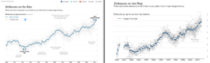
In two weeks, my classmates and I will present a dashboard visualizing a January 2015 dataset regarding the New York City bike-sharing system. Earlier today, we met for an hour half exploring the dataset together, creating individual GitHub accounts, and planning when to meet again as we set out on building dynamic visualizations with an interactive map.
Conversations about widgets, colors, and merging datasets is the epitome of being nerdy. But I know if I stay the course, such statistics and visuals will be a vital tool in advocating for evidence-based policy in the future. Sharing this experience with other beginners makes this learning curve a whole lot easier to overcome.
Looking Ahead to Spring 2017
As I prepare to repeat that 13-hour train ride once again, I will be leaving Syracuse with much hope for the future. I knew in June 2017 I would be leaving The Maxwell School with an MPA degree; I didn’t know I’d be leaving with friends who I could laugh with or commiserate with over the right way to calculate a t-statistic.